
Pantone’s Color Picks for 2016
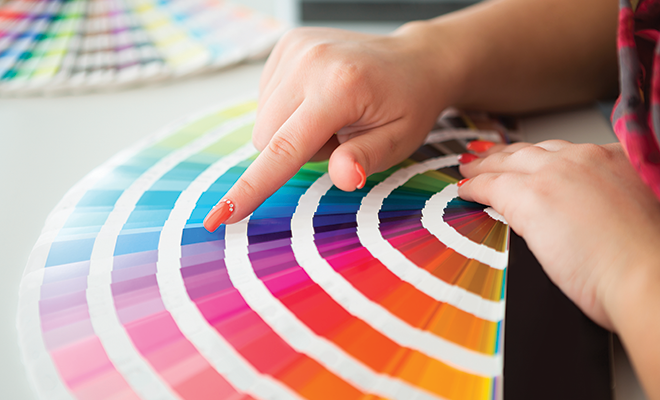
Any interior designer will tell you that color choices can make or break a design. Professional designers and retailers pay a lot of attention to color and know how important it is to stay on top of color trends. Thanks to the Pantone Color Institute, consumers can get an overview of nine key color palettes for home furnishings that are expected to be trending this year.
Pantone View Home + Interiors 2016 is a forecast report published each year by the leading authority on color standards for professional designers. The theme of this year’s report is “Innovation and Impact,” reflecting the role of traditional and digital media in introducing evocative, imaginative and innovative uses of color for interior design
According to Leatrice Eiseman, executive director of the Pantone Color Institute, “As media continue to move toward more evocative, imaginative and innovative uses of color to woo consumers, unexpected color stories are emerging, To capture attention and keep product lines relevant in the consumer’s eye, it’s important to understand the impact that this always-morphing innovation will have on color and design trends for 2016.”
Pantone encourages designers and consumers to think of each of the palettes described below as a source of inspiration for color harmonies rather than a strict guideline.
Natural Forms
Finding inspiration in the colors of nature, this palette is anything but neutral. Colors such as Moss Green, Copper, Plum Wine and Lead Blue make a bold statement, while warmer shades include Cocoon Beige, Sheepskin Pink and Bone Brown. The overall feel is simple, earthy and a bit reminiscent of the 1970s.
Dichotomy
The name of this palette refers to the attraction of opposites, but don’t expect to see typical opposites like black and white. Instead, vibrant Viridis Green, Green-Blue Slate, Bright Cobalt Blue and Canary Yellow are contrasted with the cooler and calmer colors of Jade Lime, Meadow Green, Nirvana Lavender and Silver.
Ephemera
Things that are ephemeral are transitory and short-lived, like a wispy cloud or an ice cream cone on a hot afternoon. This pastel-focused palette includes hues that create a dreamy impression, including Pale Peach, Orchid Ice, Pink Dogwood and Tender Yellow. Traditionally used in bedrooms, you can expect to find these colors being used for furnishings in other areas of the home.
Lineage
The colors in this palette evoke a sense of history and aristocracy. Jewel tones including Mars Red, Gentian Violet and Stargazer are joined by two shades of tan, Biscotti and Champagne Beige. Darker colors on the palette include Fired Brick and Caviar.
Soft Focus
Pantone describes this palette as subtle, muted and smoky. Colors like Nostalgia Rose, Smoke Green, Tourmaline Blue and Peach Nougat bridge the gap between pastel and primary colors. Contrasting darker tones include Major Brown and Starfish Beige.
Bijoux
According to the Merriam-Webster Dictionary, the French word “bijoux” describes jewelry or any dainty piece of ornamental workmanship. This palette aims for dramatic effects with rich gleaming colors like Prism Pink, Dark Citron Green, Amber Yellow, Topaz and Amethyst. Neutral hues include Tiger’s Eye Brown and Rich Gold.
Merriment
The playful colors of childhood are included on this palette. Vibrant greens and yellows, including Classic Green, Aquarius turquoise and Mimosa Yellow, are contrasted with pinks and oranges, including Super Pink, Cantaloupe and Orangeade. Two shades of gray, Ginger Snap and Sesame, are also on the palette.
Footloose
This is another playful palette that’s oriented a bit more for adults, with what Pantone calls “capricious color combinations” that support the idea of escaping the responsibilities of everyday life and enjoying the simple freedom of the outdoors. It includes beachy blues with names like Capri and Vallarta Blue contrasted by Blazing Orange. There are also colors from the garden: Winter Pear green, Deep Periwinkle Blue and Strawberry Pink.
Mixed Bag
This palette reflects the influence of diverse cultures on interior design. It includes an eclectic assortment of unique colors such as Mandarin Red, Pirate Black and Dewberry Purple. Marsala, a reddish shade of brown that Pantone called Color of the Year in 2015, is also included. This palette creates a feeling of intensity, with Candied Ginger Beige the only neutral included.
Pantone has a history of success in predicting color trends, so you can expect to see these colors used for home furnishing and accessories over the next few years. If you want to experience the color palettes yourself, you can buy Pantone View Home + Interiors 2016 on Pantone.com. The $450 price tag, which is a bit steep for non-professionals, includes the report as well as cotton color swatches, color manager software for digital design and a DVD of images illustrating the use of each palette. You can also view the palettes free of charge on interior design websites such as DesignIdeas.net. HLM
Sources: designideas.net, pantone.com and prnewswire.com.


